Monday, April 30, 2018

Royalty Makes an Appearance


Princess Anne is a fitting end to International Fake Journal Month.  She dedicated the first phase of a building project at a church not too far from my home in the Cotswalds, England.

The drawing was done with a Platinum fountain pen and a Pentel brush pen and collaged onto my background of a gelli print and a napkin.

Roz recommends that we put our journals away for a week so that we can look at them with fresh eyes.  I'll be back then with a wrap-up post about the experience.

Sunday, April 29, 2018

I Am the Real Vine


On the last Sunday of International Fake Journal Month I painted a vine and wrote out part of today's Gospel reading.  It doesn't matter where you are in the world, the scripture passages are the same, so I can be in England (working in my fake journal) or here at home and still hear the same thing.  I love that; the lectionary knits us together around the world!

Saturday, April 28, 2018

What Kind of Bird is This?


Gouache bird sketch.

Neither the fake me nor the real me have ever seen one before.  

Sketching at the Bird & Deer Park


I sketched these chickens in gouache.  The one on the recto page didn't stand out against the red background that was there so I added some green.

Friday, April 27, 2018

Looking Forward to May!


The weather has been cool and showery in England this month and I'm looking forward to a drier May.

Tuesday, April 24, 2018

Tis the Season for Boot Sales!


A boot sale is a sale where you display your wares from the "boot" (trunk) of your car.  It's a cross between a swap meet and a garage sale, perhaps.  I think that you buy a place in a field to park your car, much like you would buy a table at a swap meet.

My journal for International Fake Journal Month takes place in England.  Aren't you glad April is almost over? LOL

Lots of Bird Action Returning to Our Area...

Sunday, April 22, 2018

Geography is Destiny


At the WWT these birds are being trained!  This is another entry in my International Fake Journal.  Just over a week left!

Friday, April 20, 2018

Frogs Seem to Spend a Great Deal of Time Thinking...

By Hand: The Art of Modern Lettering


Lettering has made something of a resurgence in the last few years, particularly drawn letters (think menus on chalkboard) and script like you see on the book cover above.  Nicole Miyuki Santo, the author of By Hand:  The Art of Modern Lettering describes modern lettering as "drawing letters, not writing them.  It is embracing the perfectly imperfect, the freedom to express yourself, and the liberty to experiment."

Her book embraces all of this and combines it with fresh photography, resulting in a truly beautiful book.  The paper is thick and the book is hefty, at over 270 pages.  The unique binding lies flat when open, making it great for reference while doing examples or for tracing.

This book is mostly about brush lettering:  the first of three sections focusing on brush pens, the second section on brushes with paint, and then a final section on other kinds of pens.  The style of lettering taught in the book is script (with some variations) like you see on the cover.  A combination of lettering examples, how to's and projects are interspersed with other material; each project matches your level of skill as you progress through the book.  Amazingly, the second project is a framed exemplary made by tracing a page in the book.

This is a great book for beginners, but as a more experienced brush letterer, I still found lots to love.  A lesson on using thumbnail sketches to design layouts is very useful once you learn how to draw letters and connect them into words.  The lesson on flourishes shows how to take your letters and words and extend them to form something outside of the basics.  There is a lesson on how to add a bounce to your letters (something traditionally trained calligraphers may struggle with), and a lesson on options for laying out envelopes.

There are more than 30 fun projects from banners to menus to placemats and even a pillowcase included in this book.  You can letter on wood, glassware, and acrylic.  You can even letter on balloons!

Hop on over to Amazon where you can "look inside" and see what a truly beautiful book this is!


Thursday, April 19, 2018

A Spring Heatwave...


...is a perfect time to sit at a quiet spot on the canal and do a little sketching.  Markers on gelli print. 

Wednesday, April 18, 2018

Tuesday, April 17, 2018

The Farmers' Market


At last a dry day to visit Shambles (the Stroud market) - just for fun, to sketch. After vegetables, text and signage catch my eye.

Sunday, April 15, 2018

Working with Thick Gouache


One of my objectives for International Fake Journal Month is to work in thick gouache.  When used directly from the tube, gouache behaves somewhat like acrylic, without the clean-up issues.  (Gouache is water-soluble even when dry).  When you use it thick, without diluting it with water, paper thickness/quality isn't an issue either.  This painting of a kite at the Minchinhampton Kite Festival was done on drawing paper and collaged on the page later.  (I also used gouache directly on my background print on the Peter Rabbit page here.)

Friday, April 13, 2018

Resolving Journal Issues in International Fake Journal Month


A couple of quick drawings done at the Chalford scarecrow trail.

One of my long-standing journaling issues has been chronology.  I want to keep a single, chronological journal, and end up with 20 journals on the go at once, primarily due to paper qualities and journal format (square vs. rectangle, type of binding, size, etc.).

The International Fake Journal Month is giving me the opportunity to work in a single journal for a whole month.  By drawing on separate sheets and collaging them in later I can resolve other issues as well.  We'll see how I like this at the end of the month!


Wednesday, April 11, 2018

Week Two, International Fake Journal Month


A local WWII spitfire pilot passed away recently at the age of 94

Roz, the organizer of IFJM, encouraged us to set some goals for our journals.  I thought mine were fairly simple (take more risks and paint in thick gouache), but I'm finding that there were a few others lurking in the back of my mind.  I don't like all of the completed pages, but that is to be expected if I'm taking more risks, isn't it?  In this one about the local spitfire pilot, the drawing is rather grotesque and I don't like the colors much, but maybe this has taught me to think more about the colors before I pull them out.


Hare sculptures are being decorated by local artists and will be on display around town on the annual Cotswald Hare Trail

Sunday, April 8, 2018

Week One, International Fake Journal Month


The weather in Stonehouse has been similar to Vancouver this past week - rainy.  I feel right at home!


My sister lives 10 minutes away instead of across the country - hey it's MY fantasy, right?


In Stonehouse you can kayak to work.


On this day I'm thinking about taking a bulrush weaving course.


Peter Rabbit makes an appearance.


Rain, rain, go away!


A local author celebrates a new book.

Thursday, April 5, 2018

Working in Series


I did this series of small gelli prints all in one day.


I used the same handcarved stamp and a limited color palette.


Wednesday, April 4, 2018

Tuesday, April 3, 2018

March's Calendar Project


It was my sister Dianne's turn to pick the theme last month, and she chose "things that fly".  It was a challenge to think of so many things that fly; I think I cheated a bit.  LOL

Monday, April 2, 2018

The Art of Hand-Lettering: Techniques for Mastery and Practice


I know Dover Publications mostly from their clip art books.  What I didn't know is that Dover also has an extensive list of reissued out-of-print books.  This one on hand lettering is from their Lettering, Calligraphy, and Typography catalogue, but they also have hundreds of art instruction, anatomy for artists, and other books about art.  (You can review their titles here.)  Most of them are very affordable at under $20.  The Art of Hand-Lettering is one of many priced at $14.95US.

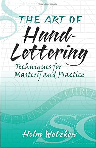
This book was originally published in 1952.  Although lacking the rich color photographs we have come to expect in art books today, it is a both a broad and dense look at the materials, methods, history and techniques for mastering and critiquing hand lettering.  Helm had extensive years of experience in the advertising business when he wrote this book and this shines through in the tips he provides on every page.

After discussing materials, Helm looks at the basics of good lettering and how to critique your own and other people's efforts.  He then analyzes the Roman alphabet, which is the basis of most other alphabets.  A brief history of the Roman alphabet is provided, as well as the Italic, Gothic, Script, and Block styles, which he maintains are the five styles on which all lettering is based.

He provides lots of examples, although his goal is clearly to have lettering students develop their own styles rather than parrot the exemplars of other letterers.  He provides more discussion of spacing and layout than I have seen in many books.  In the Handy Hints section I was pleased to see some pages on brush lettering.  Again, he emphasized the basics of handling the brush rather than providing a brush alphabet to follow.

Although my lettering and calligraphy library is not large, this is a welcome addition.  I noticed while tending the Westcoast Calligraphy Society's library the other evening that they have an original edition of this book, and someone borrowed it.  So, it may be an older book, but its value lives on.


Sunday, April 1, 2018

Happy Easter from Stonehouse, England!


No, I'm not really in England, but I'm participating in International Fake Journal Month which runs in April each year.
 
I'm transporting myself to a very small village in the Cotswalds, England.  I have been become increasingly interested in researching my family history, so I'm pretending that my ancestors didn't leave that area, but that I still managed to end up on the planet.  I'm hoping to learn more about the area and what life is like there now.
 
That's a picture of my house and a gouache painting of some hot cross buns.  Roz is giving us some prompts if we care to use them and one of today's prompts was "bakery goods".
 
I prepared my journal by gelli printing some wild backgrounds.  In this pretend life I take way more risks in my journal, for better or for worse.  Painting in thick gouache is new to me too.